mCommerce: Selling to Customers on the Go

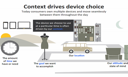
Mobile shopping is huge, and all brands need to acknowledge this. In a previous blog post, we discussed how the growth of mobile is steadily changing the online landscape. People are starting to use their phones for everything, and shopping is no exception to this.
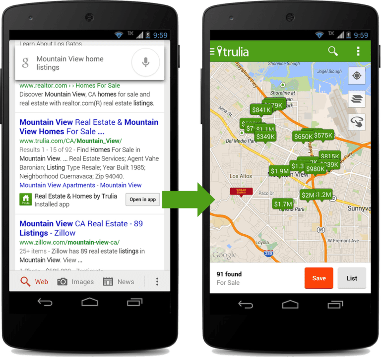
Smartphones have made it incredibly easy to purchase anything on the Internet. No matter where a person is or what they are doing, it only takes a few minutes for them to go to their favorite online store and punch in their credit card details. Unsurprisingly, this convenience has led to the meteoric rise of mobile commerce.
Last year, Shopify revealed that over half of all eCommerce traffic comes from mobile devices. Instead of desktops, more people are now using their phones and tablets to browse stores. The numbers have only continued to climb since then.
Today, no merchant can afford to ignore this massive segment of the market. A store that wishes to stay relevant and competitive must adapt to the changing customer expectations. What can a brand do to meet the needs of their mobile customer base?
The Keys to Effective Mobile Store Design
Simplicity and responsive design are of the utmost importance. Mobile users appreciate being able to find what they need fast, and purchase it with minimal difficulty. When designing a website, brands need to make sure that user experience is seamless from beginning to end.
While every website is different and has a unique target market, these best practices should be followed by all businesses:
- Thumb friendly interface – Have you ever been frustrated when purchasing something online, as the buttons were too small or poorly located? Many websites forget to consider how easy or difficult it is to press the CTAs. Make sure your website’s buttons are sufficiently large, and avoid placing them at the edges or corners of the screen.
- A simple homepage – The homepage of an online store has two important roles: earn the customer’s trust, and tell them how to proceed. It must look professional and well-designed, but still be simple enough to scan in just a few seconds. Keep your copy short, use large fonts, and make sure that navigation to product pages is very intuitive.
- Fast checkout process – Once a customer reaches a decision on what to purchase, the last thing you want is to make them jump through more hoops – that’s the fastest way to shopping cart abandonment. Simplify forms to the bare minimum, fit everything into one page, and remove mandatory registration; that can wait until after the purchase.
- Implement data persistence – Typing on a small screen is always tedious, especially when it comes to information like credit card numbers and addresses. The last thing your customer wants is to start over in case they accidentally hit the back button. It is crucial to implement data persistence on forms – or at the very least, warn users when the action they are about to take will erase current input.
With today’s highly competitive market, online stores must be designed with a digital marketing strategy for ecommerce that benefits all customers, no matter what device they are using. Stores that do not adapt will be hard-pressed to maintain their market share.