Descriptive Analytics: Unlock Hidden Insights

Descriptive analytics is the statistical method that summarizes historical data into patterns, trends, and KPIs. It answers one question: what happened? Every other analytics layer, from diagnostic to prescriptive, depends on descriptive output as its starting input.
TL;DR: Descriptive analytics converts raw historical data into the reports and dashboards your team reads every morning. It’s the most widely used form of analytics, and it feeds every higher-order model your organization runs. Understanding how the mechanism works determines whether you’re reading real insight or inherited noise.
What Descriptive Analytics Actually Answers
Descriptive analytics answers a single question: what happened? It doesn’t explain why, forecast what’s coming, or recommend what to do about it. That constraint is the source of its power. The answer has to be grounded entirely in recorded fact.
Harvard Business School Online explains that descriptive analytics “directly compares items across periods, as well as your company’s ratios to the industry’s to gauge whether yours is over- or underperforming.” That comparison function sits at the core of the method. It takes your historical data, applies statistical summaries, and returns a structured picture of past performance.
The mechanism works across every business function. In marketing, descriptive analytics produces the weekly traffic report, the campaign performance dashboard, and the quarter-over-quarter conversion summary. In finance, it produces income statement trend analysis and ratio comparisons. In operations, it surfaces throughput rates, fulfillment timelines, and inventory turnover figures.
NetSuite’s analytics guide calls it “the most basic and widely used type of analytics,” adding that it produces “the key performance indicators (KPIs) and metrics included in business reports and dashboards.” That “most basic” label misleads people. Basic here means foundational, not elementary.
How Raw Data Becomes a Summary
The descriptive analytics pipeline follows a consistent sequence regardless of the tool running it. Each step shapes the quality of the final output.
Step 1: Data Collection
The process begins with gathering data from every relevant source. For a marketing team, that means web analytics platforms, CRM records, ad platform exports, email service providers, and social media dashboards. Industry data from Brave shows that 40% of U.S. retail companies and 60% of GPS-based service providers already use descriptive analytics to track customers, teams, and assets.
The collection stage matters because descriptive analytics can only summarize what it receives. Missing sources create blind spots. If your paid media data lives in one silo and your organic data in another, the descriptive output will show two partial pictures instead of one complete one.
Step 2: Data Cleaning and Preparation
Raw data contains duplicates, null values, formatting errors, and timestamp mismatches. Cleaning removes or corrects these problems. The goal is to make sure the statistical summaries reflect reality instead of noise.
This is where many organizations underinvest. A dashboard built on uncleaned data still produces charts and trend lines. Those charts look authoritative. But the numbers behind them carry errors forward into every decision that follows.
Step 3: Statistical Summarization
Clean data gets processed through core statistical techniques. These include measures of central tendency (mean, median, mode), measures of spread (range, standard deviation, variance), and frequency distributions. Valamis defines the method as “a statistical method that is used to search and summarize historical data in order to identify patterns or meaning.”
These summaries compress thousands or millions of data points into a small set of numbers that humans can interpret. Your average order value, your bounce rate, your month-over-month traffic change: each one is a descriptive statistic derived from raw event data.
Step 4: Visualization and Reporting
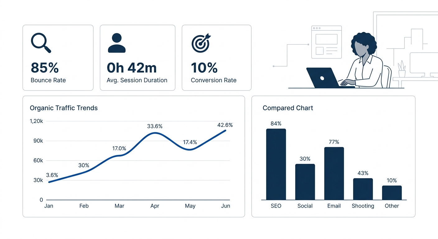
The summarized data gets packaged into visual formats. Line charts show trends over time. Bar charts compare categories. Pie charts show composition. Heatmaps highlight density. Dashboards combine multiple visualizations into a single view.
Effective descriptive analytics packages complex data into charts and graphs that make information digestible for stakeholders. That packaging step is what turns statistical output into organizational knowledge. Without it, the numbers stay locked inside spreadsheets where only analysts read them.
Five Techniques That Power Descriptive Output
Descriptive analytics relies on five core techniques. Each extracts a different kind of insight from historical data.
Statistical analysis calculates central tendency and spread. When your dashboard shows that average session duration dropped from 3 minutes 12 seconds to 2 minutes 41 seconds, statistical analysis produced that number.
Data aggregation combines records from multiple sources into unified datasets. A brand running campaigns across Google Ads, Meta, and TikTok needs aggregation before it can see total spend, total impressions, and blended cost-per-acquisition in one view.
Data mining sifts through large datasets to surface patterns, correlations, and anomalies. If your top 8% of customers generate 43% of revenue, data mining is the technique that surfaces that relationship.
Cross-tabulation breaks data into subgroups and compares them. It answers questions like “Do mobile users convert at a different rate than desktop users?” or “Does Region A outperform Region B on the same creative?”
Benchmarking compares your metrics against industry standards or your own past performance. Harvard Business School Online highlights that this technique compares your ratios to the industry’s to show whether you’re over- or underperforming.
Every higher-order analytics model inherits the accuracy, or the errors, of its descriptive foundation.
Organizations that understand how data analytics and big data differ will recognize that descriptive analytics applies these techniques to structured, historical datasets rather than processing raw big data directly.
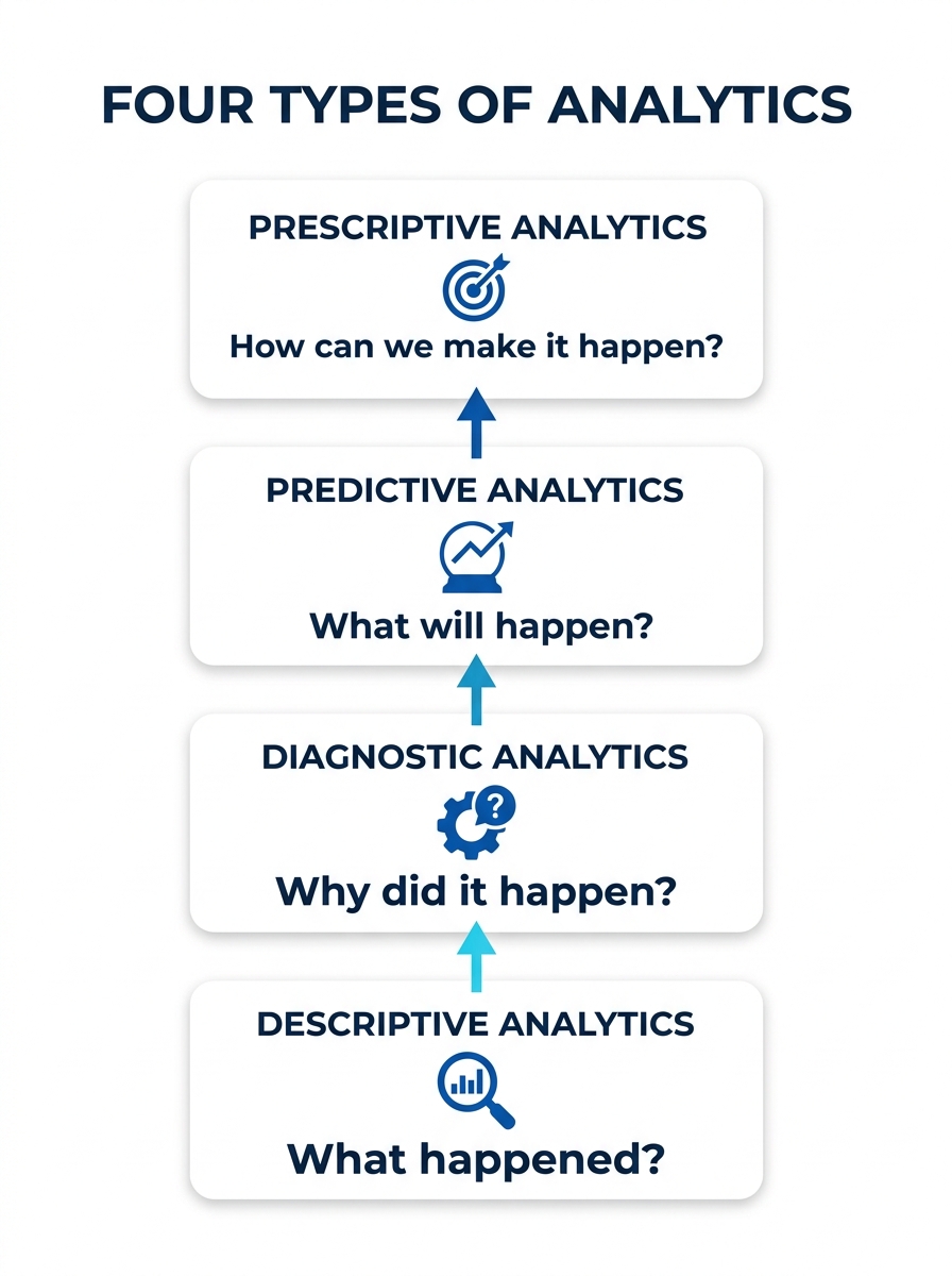
Descriptive vs. Diagnostic vs. Predictive vs. Prescriptive
Descriptive analytics forms the first of four primary analytics types. Each answers a different question, uses different methods, and requires a different maturity level. Domo’s 2026 analytics tools guide identifies a fifth type, cognitive analytics, which processes unstructured data with AI.
| Analytics Type | Question Answered | Primary Method | Data Direction | Complexity |
|---|---|---|---|---|
| Descriptive | What happened? | Statistical summaries, aggregation | Backward-looking | Lowest |
| Diagnostic | Why did it happen? | Drill-down analysis, correlation | Backward-looking | Moderate |
| Predictive | What will happen? | Statistical modeling, machine learning | Forward-looking | High |
| Prescriptive | What should we do? | Optimization algorithms, simulation | Highest | Highest |
InsightSoftware’s analytics comparison frames the distinction clearly: “Descriptive Analytics tells you what happened in the past. Diagnostic Analytics helps you understand why something happened. Predictive Analytics predicts what is most likely to happen in the future.”
The key relationship is dependency. You can’t diagnose why revenue dropped 12% (diagnostic) if you haven’t first confirmed the drop and measured its size (descriptive). You can’t forecast next quarter’s pipeline (predictive) without clean historical pipeline data in a usable form (descriptive). The further up you go, the more the quality of your descriptive foundation controls the reliability of every output above it.
This is why organizations that jump straight to predictive modeling often produce unreliable forecasts. The prediction algorithm is fine. The descriptive layer feeding it incomplete or poorly structured data is the real problem. If your marketing measurement framework is undergoing a rebuild, the descriptive analytics layer is where to start.
The Tools That Run It
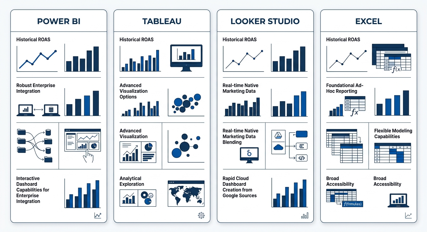
The tool landscape ranges from spreadsheets to enterprise BI platforms. Your choice depends on data volume, team size, and reporting complexity.
Microsoft Power BI connects to data sources including Excel, SQL Server, and Azure. Aziro’s tools analysis describes it as well-suited for enterprises already invested in the Microsoft ecosystem, with strong interactive visualization and business intelligence capabilities.
Google Looker Studio serves as Google’s free-tier BI offering. It connects directly to Google Analytics 4, Google Ads, and BigQuery. For marketing teams already working within the Google stack, it removes the data-connection overhead that slows reporting setup.
Tableau remains the standard for complex data visualization. Its drag-and-drop interface handles cross-tabulation, statistical drilling, and multi-source blending without requiring SQL knowledge from end users.
Excel and Google Sheets still power descriptive analytics at smaller organizations. For teams producing fewer than 10 regular reports with under 100,000 rows of data, a well-structured spreadsheet delivers the same statistical summaries a BI platform would.
Tip: When evaluating these tools, the deciding question isn’t “which is best?” It’s “which one connects to our existing data sources with the least manual effort?” A tool that requires 3 hours of weekly data prep will produce worse outputs than one that pulls live data, regardless of visualization quality.
Where the Model Breaks
Descriptive analytics has clear boundaries, and pretending otherwise leads to bad decisions. UNSW Online’s analytics guide states the core limitation directly: it “doesn’t look beyond the surface of the data.” It tells you that traffic dropped 22% in May. It does not tell you whether the drop came from a Google algorithm change, a seasonal pattern, or a broken tracking pixel.
Three organizational barriers also cause descriptive analytics to underperform within its intended scope. Industry research identifies the most critical: lack of organizational strategy, lack of involved management, and lack of available talent. These three factors cause more analytics failures than any technical limitation of the method itself.
The first failure mode is incomplete collection. If your analytics covers 6 of your 9 active marketing channels, the descriptive summary represents 67% of reality and misrepresents the rest. This happens often when teams run campaigns across platforms that don’t share a common data layer. A conversion rate optimization program, for example, needs complete funnel data from every traffic source to produce reliable conversion rates.
The second failure mode is poor data hygiene. Duplicate transactions, bot traffic counted as real sessions, and timezone mismatches between ad platforms and your analytics tool all distort the output. Each distortion is small on its own. Combined, they shift reported metrics by 10% to 25% from actual performance.
The third failure mode is treating descriptive output as if it were diagnostic or predictive. When a dashboard shows a 15% drop in organic traffic and someone in the meeting says “our content strategy isn’t working,” they’ve jumped from what happened to why it happened without doing the diagnostic work. That shortcut produces bad decisions wrapped in good-looking data. If your organization keeps running into these failure modes, a digital marketing consultation can audit where the descriptive layer is breaking down before you invest in advanced analytics infrastructure.
Descriptive analytics works because it refuses to overreach. It summarizes what happened, structures that summary into visual and statistical formats, and stops. That discipline is what makes it reliable. Every KPI your team tracks, every dashboard your CMO reviews, and every monthly report your agency delivers depends on this mechanism doing its job correctly before anything else can begin.