Truelogic Episode 88 Recap: Why Users Don’t Like Your Website?

Podcast Transcription
Berns San Juan: Let’s talk about user behaviors. I wanted to give a title to this episode why don’t they like me, me being a stand-in for your website? Why don’t your users like your website? So welcome to another Truelogic DX Podcast. We’re going to talk about conversions. You have control over the things you can do that can influence users to execute the behavior or the action you want them to do when they get to your website.
We’re going to break this like Voldemort’s soul and separate it into seven different parts. But essentially, brands spend billions and billions and billions of dollars. And if we’re talking about an individual brand, we’re talking about millions of dollars, millions of pesos to attract audiences and users to their websites. But that’s just half the ballgame, maybe not even half the ballgame.
A lot of them are great at attracting users, but like the proverbial dog chasing the car, the moment they’ve got the user on the website, now what do you do? And so this is what we’re going to talk about today. We’re going to talk about the things that are within your control to convince your users and influence your users, to take the logical behavior and the logical action you want them to do when it comes to your website. So I guess in short, you could call this a CRO episode, a conversion rate optimization episode. Let’s get started.
Technical Elements of the Website
The first thing you want to look at is the technical elements of your website. So element number one, is the technical elements on your website, the things that encourage or detract users to stay on your web pages. A couple of things to look at, and when there are a lot, by the way, I’ll stick to, the top three.
So is your site, does it load fast? Like can a user see it in two seconds or less? Is it device-agnostic? Can a user see it regardless of whether they’re on an iPhone an Android or a PC? Will it look the same if they’re on Firefox, Edge, Chrome, or Safari?
Is your website secure or is Google going to give your user a warning that, Watch it, this website is not secure? Is your website secure? To a degree that means did you renew your last SSL certificate? The website addresses that you have, are they pretty safe? Like especially since, you know today, there are a lot of scams going on, right? Like are you guys seeing weird TLDs on these websites, right? And is the text in the address bar something that’s readable?
For technical, just as a quick summary, what you wanna look at is, does your site load fast? Is it mobile-responsive? Can it be seen on any browser? Is your website secure? Those are the main parts to look at when it comes to things that encourage or detract a user’s behavior on your website.
Website Navigation
So you’re doing SEO services, you’re doing social media marketing, you’re doing ad words, you’re doing EDMs and you got the user to click and now they’re on your page. Is it easy for them? Is it intuitive for them to find their subject matter of choice, their product of choice, their service of choice, their category of choice? And so the next thing we’re going to look at is, okay, now they’re on your site and they’re navigating, they’re navigating through your website.
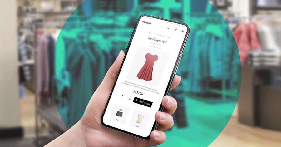
Are you calling their attention to the elements you want their attention on? So for example, does your website have a clear menu structure? Meaning if you expect the user to click a navigation element for a drop-down to appear, is it intuitive to the user that they’ve got to click the element? If it’s not, then do your menu items automatically drop down the moment somebody mouses over them, right?
Next, the primary category that appears at the top, let’s say banking. Like if I’m looking for a checking account and then I don’t see checking inside the nav, I would probably look for it under a category called deposits. So if I mouse over deposits, am I going to see it there, right? Am I going to see savings, checking, and dollars? Like whatever deposit products you have. This is an example of a clear menu structure. Can your users navigate through the menu of items you have at the top in a very intuitive fashion?
Next, menu volume. If the first one was, is common sense all I need to get to the product or the service that I want? The next one is, how many products or services are calling for my attention. You do want to limit the number of items on your menu, especially if you’re device-agnostic. Because let’s face it, if you’ve got 50 items appearing on a nav, it doesn’t matter whether that person is on an iPhone 15 Pro Max, that’s not enough screen space to see everything you’re trying to offer.
So make some pages subservient to others, like where those pages are not highly critical products, they’re not highly critical services. And if you’re forced to make a choice, limit your navigation to the top 20% of products or services that contribute to 80% of your revenue, right? Or at least the top 20% of products or services that create 80% of the value to your users. Reference note here, if you want to know what I mean, go to the Apple website. You guys all know Apple has a caboodle of products, but look at how clean their menu is.
How do you label the items on your menu? One of my critiques, with a lot of brands, is instead of the product descriptor, instead of the product category, they’ve got the brand name of the product appearing on the nav. But the user won’t know that. If I labeled our products the Willy Wonka service, I might know what that is. I don’t know what that is. I don’t have a product called the Wonka service, but let’s say I did. And let’s say that’s what I called our link-building service.
I’d know what that is, my users won’t. So if what you’re expecting are new users to come into your website, discovery audiences to come into your website, use descriptive labels for the items in your nav. Don’t use your proprietary brand terms for it because you’re going to know what it is but your user will not. And guess what? Your website’s not for you, right? Your website is for them.
Next, hierarchy. If I had an e-commerce store and let’s say one of the products that I sold in it was an iPhone, the iPhone would fall under the smartphone category, right? And if the smartphone category falls anywhere, it might fall under devices. This is a logical order. I would not put, iPhone on my nav, and then on a dropdown, I would put other devices, Android phones, right? Like that’s not a logical order and that’s, and a user looking for an Android will not think to look for it under an iPhone app, right? So that’s another example.
The other one that I would say in terms of user experience via navigation is, is design consistency. If your nav has a certain color and looks a certain way, make sure that it has that color and looks that certain way across all your pages, right? Like, don’t change them when they go from page to page, to page. By that token, and I’ll go back to this when I get to the design part of this conversation, keep your page designs consistent because you don’t want users to suddenly stop their experience thinking, oh wait, did they move me to another webpage, right? Like, is this a scam? So design consistency, is pretty important. So we have two elements of Voldemort’s soul.
Website Design
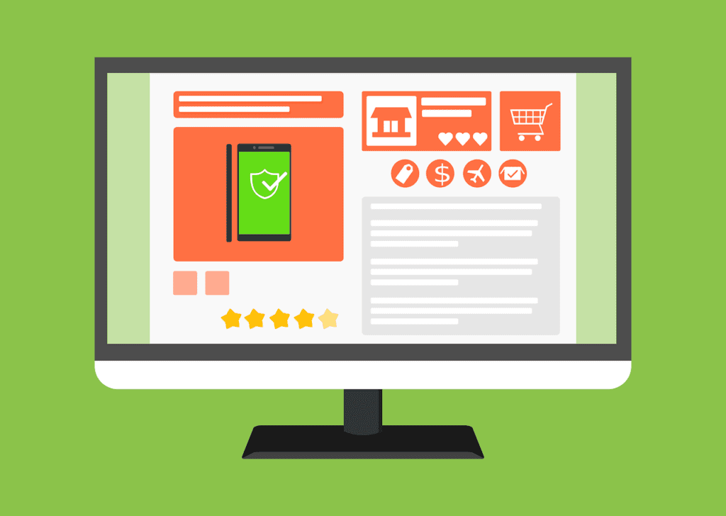
Let’s go to the third. This one is a mouthful and a can of worms at the same time. It’s the design. When it comes to design, I’ll give you guys a couple of tips. Remember, don’t take these as gospel truths. These are just best practices. Okay. When it comes to design, one of the design elements that I will highlight is hierarchy.
Imagine your web page is a stage in a stage play. You cannot have 12 spotlights pointing in 12 different areas on the stage or the users just lose everything, right? And so this is what hierarchy is for. Yes, you can have a hundred elements on a page. You can have 15 actors, 70 props, and three sets. But what the hierarchy does is it allows you to shine the spotlight on where you want the user’s attention.
So make sure you’ve got a clear visual hierarchy. The eye tends to move from empty to cluttered, from small to large elements. Make sure that on any given fold, on any given screen, on any given section of your webpage, there is only one star for that section. There is only one star on the stage. That’s the clear hierarchy.
Next, branding consistency. Make sure that the branding elements, the way you represent your logo, the way you represent your text, your font selection, and your colors are consistent across all experiences on your website. Again, when it changes, the first thing that users will look at is the address bar. Did they route me to another address? And then the next question is, I guarantee, is this a scam? So make sure that the branding is pretty consistent.
Even if you move the user to a more secure URL because they will transact, they will put personal information, make sure that the user does not stop because the look and feel have changed. Like, keep the branding as consistent as you can.
Next, on the design, readability. And when I say readability, it’s two things. a. it’s font size and b. it’s the scannability of the content. Scannability of the content means you create bite-sized headliners so that the user can zero in on the content that they want or on the content that’s relevant to them. But font size because on desktop design, smaller font sizes are great but they rarely translate well to mobile devices. If on a mobile device, the text is too small, that’s problematic. That’s another element to look at.
Next, page width. Is your page width considerate towards your users? Or is your page width optimized exclusively for desktops and then to hell with mobile users? I guarantee your mobile users are within 40% to 60% of the total audience that goes to your website, so don’t ignore them. Optimize your page width at the minimum. Make sure your site is responsive.
Next, design-wise. For heaven’s sake, test your call-to-action buttons. Don’t assume, oh I made it, my site is blue and I made it red, therefore users will see it. Not always. Oh, my website is dark, I made my CTA a complimentary light color, so my users will see it. Not always. So make sure you test the placement, the text, and the color of your CTA buttons. I’m only talking about CTAs for design. I’ll have another Horcrux for CTAs on its own.
The other element I want to talk about design is the things you put above the fold. There are only two pieces of content. There are only two things your design is meant to address above the fold. That is either highlighting the problem of the user, highlighting the problem of the customer, or highlighting the virtue of your product. That’s it. Those are the only two things you put above the fold.
If it’s a PPC landing page or if it’s, you know, if it’s an ad landing page, then yes, a contact form, an action button, something, right? But if it’s an organic page, you want to focus on either the friction or the problem of your customer or the virtue of the product. Okay, that is it for design.
Let’s go to the fourth element. Let’s talk about the forms. One of the things that you want to direct your users’ attention to are the forms that they will fill out on your website. There are times when it’s, getting a quote, but it’s asking for the first name, the last name, the phone number, the email address, a quick message, the name of the business, and the business phone number. Why do you need all of those?
The most optimum number that you want to fill out in forms is about three. Four is also still pretty optimal. But where you’re able to limit it to three, limit it to three. Now I do accept the argument that, okay great, but if it’s only three forms, then I can’t weed out bad leads, I can’t weed out bad inquiries, and that’s true.
And so this is a trade-off of quality versus volume because the argument I’ve heard is if people are really serious, they’ll fill in that information. Sure, as long as the information you’re not asking for is not frivolous, but why not make it two steps? Why not make the initial form three forms, and then if they’re requesting for a quote, for let’s say a car loan, then sure, put all of the mandatories on a secondary page. But the initial form ought to be only three to four fields and nothing more than that.
Now when it comes to managing more complex forms, like again, a car loan page, a personal loan page, and whatnot, try to do progressive forms and don’t try to bombard the user with, okay, here are these 20 fields, fill them out. Remember, it’s not a piece of paper. Right? So try to do progressive profiling of the page. Meaning, as your user fills in more basic information, show them the number of steps left for them to complete the form, and try to put in anywhere only between 3 to 5 fields per section of the form they’re filling out.
Next, completeness. Can they see the full form in one fold? Okay, I know that that was a little alliterative, but can they see the full form in one fold? Like means, on one screen, they see the first field of the form and the submit button all on one screen. Like they don’t have to scroll down and click submit. So make sure that the full form is visible in one fold.
Next, if your product or service is really valuable if the conversion of that user is valuable, is the form persistent? Does it exist in multiple sections of the page or does it have the ability to follow the user as they go through [page], right? In some instances, repeat instances of the form are better. And in some situations, a persistent form is better. And I can’t list down all of the applicable ones. So a repetitive form and all of the applicable ones to a persistent form, but never only have one form in one page found only in one section.
Next, have you enabled smart defaults? Like does the form give an example in a grayed-out version? Does the form have an example, here’s the type of information I accept in this field. Right? That’s an example of a smart default. And then in case the user fills it out wrong, do you make them redo the whole thing? Or do you direct their attention to where the error is? Right? I still experience this a lot where there’s a missing element on a page and I have to personally scroll through where the error is. Looking at you, Airlines, this is you guys.
Okay, for auditing the forms, are your forms simple? Are they front and center? If it requires a chunk of information, do you split those up so that you can progressively fill them out? Are your forms either persistent or repetitive? And then do you have smart defaults? Do you have sample information filled out in the forms? Those are what you need to do to influence your users to complete a logical action on your page.
Next, on your content, and this is where we will get a little hairy. Okay, is your content solution-centric? Remember that if your product is an auto loan, the user’s desire is not to acquire an auto loan. When your product is an auto loan, the user’s goal is to own a car. So remember, if you’re going to create content that’s solution-centric, a person applying for a car loan, the goal is not to acquire a car loan. Their goal is to acquire a car. You are just a vehicle to them acquiring the car loan. So solution-centricity is your content solution-centric.
Next, is it, audience aligned? Do you have female content, and female imagery when your audiences are women, or do you have men in that imagery? Right. Like, but be consistent. You don’t use female models for let’s say men’s underwear products, right? Like, so do you have audience alignment? On audience alignment, make sure that the images you use, even if they’re stock photos, there’s no excuse for using ethnicities that are so off from the identity of your users. Make sure that the people and the hero images you use look like your users, right? Albeit slightly more attractive versions of your users, they need to look like your users.
Okay, next, verbiage simplicity. Are you using terminology that your users speak in daily life? Are you using words? Are you using terminology? Are you speaking the way your users speak in real life? Like that’s it for simplicity.
Next, on the content, do you have an emotional hook? Remember that in a branding exercise, a brand says, I’m a ruler brand, I’m a sage brand, I’m a hero brand, I’m a rebel brand. All of these brand archetypes are just types of emotional appeals that a brand will make. Because all products and services must make an emotional appeal to be effective, does your content make an emotional appeal to your users?
Because if all you’re giving them are the features of your product, be prepared to the user that offers them the cheapest product. Right? Like, so make sure that there’s an emotional hook when you create your content.
Next, on the CTA content, is it compelling? Is it structured in an imperative, like meaning there’s a command line there? Is there a verb there? But is your CTA, is your call to action content imperative? It’s the difference between clicking here and learning more. It’s the difference between getting started and requesting a quote. Right? So those are examples.
Next, is your value proposition present? Not the brand’s value proposition, because we’re talking about the conversion on a page, is the product’s value proposition consistent, right? The product’s value proposition might be consistency, and the product’s value proposition might be performance. Do you say that in the content you use to describe the product?
The last element of content is whether you have social proof. And I’ll treat social proof as a whole section on its own. If you want to convince users, you guys can use an element called social proof. And there are different types of social proof. You ought to be using at least one to two on any given page. But do you have testimonials on the page to convince users? And the testimonials need to come from people that look like them? Do you have featured social proof like, as featured in ANC, as featured in Business Mirror, as featured in Rappler, or wherever?

Like if you were ever featured anywhere if anybody ever made noise about you, do you brag about that on the page? Have you won any awards? Oh, take note. Have you won any meaningful awards? Like award badges, yes, award badges that are meaningless but look nice still have a psychological impact. But the most important ones are ones that ring a bell with users, like the Philippine Webby Awards and so on. Those are examples of awards that you might have won.
Next, trust badges. Are you associated with or certified for any regulating body? Take, for example, a Google Partner badge, or an ISO badge. Are you a member of a certain exclusive group? Those are badges. And I will argue the last most important piece of social proof, user reviews. If your product is really good, you will not be afraid of your customer’s voice. Like do you publish or enable customer reviews on your pages? That’s social proof.
Let’s go to the last one. And the last one is what I call directionality. Your ability to lead users to logical action. A lot of this is related to the call to action, but I call it directionality, like can you lead the user to the logical action you’re doing? So first off, your primary call to action, is it front and center? Is it above the fold? Is it one of the first things they see the moment your page loads? So the primary call to action present above the fold is great directionality.
The next one, does it have the ability to capture attention? Is your action button obvious? Does it complement or contrast well with the design? Next, is it persistent? Does your action button appear in multiple sections of your page or does it have the ability to follow the user around?
Next, is there a secondary CTA? On the Truelogic website, if I can’t get you to request a quote, which means I’ll assume you’re probably not my target audience, but our content is valuable to you, I offer you a secondary CTA, meaning subscribe to our newsletter to get alerts on our content. Right? Like that’s a secondary CTA.
Do I make money with you being part of my newsletter? Not necessarily, or at least not right now, right? At least you’ve given me enough information and you’ve permitted me to market to you. That’s a great secondary CTA. If I can’t have you as a lead, I at least have you as an audience profile.
Okay, next. Do you execute any form of contingency? The user is exiting the page without having done a logical action. In a sales process, this is equivalent to overcoming objections. Do you have an activity? Do you have a function on your website that allows your page to overcome the objection of exiting? Is there a pop-up with a value proposition encouraging them to return to the page? That’s a contingency element.
Next, is attention management. Now, this is a bit different because I don’t recommend this for organic pages. After all, SEOs need the links in the headers to reinforce the pages that they want, that they’re trying to drive performance for, sure. But specifically with ads, the header and the footer are exit points. So the headers and the footers are exit points because these are site-wide links and they lead to a caboodle of other pages.
Make sure that if the nav is there, you are attracting minimal attention to the nav or that you eliminate it if this is an ad landing page. So directionality, social proof, content, forms, design, navigation, and technicality. These are some of the seven things you want to look at if you want to figure out why your users don’t like you.
Now pro tip. What turns off your users is probably only one to two of those. So you, by no means do you have to get everything I said perfect, right? But you do need to figure out what are those one to two elements that we just talked about that are a real turnoff for your users, and that’s really what you’re doing when you do this audit. You’re going to hedge your bets and you’re going to try to figure out which ones of these piss-off users and get them to leave my page.
So hopefully, you know, this was a lot, right? And if you’ve been keeping up and if you list this down, great. But I would encourage you to start looking at your web pages, especially 2024, right? Start of a new year, an opportunity to do better than last year. I would strongly encourage, now is a great time to start reviewing the potential or the weaknesses of your online asset.
And with that, I want to thank you for joining me for this episode, and hopefully see you on more episodes to come. I want to thank our marketing team and the Podmachine for producing these episodes for you guys. And we’re open to suggestions. It’s a new year. We want to hear your ideas or people that you want us to talk to. And I’ll look forward to seeing you on the next episode.
Thanks for tuning in to the Truelogic DX Podcast, an audio production show for people who want to take their digital marketing game to the next level. Truelogic DX is powered by Pod Machine. If you enjoyed today’s episode, follow Truelogic on Facebook, LinkedIn, and YouTube. Check out our website at www.truelogic.com.ph for more information on digital marketing. And make sure to catch our upcoming episodes on your favorite podcast network. Until next time.


