Infographics for Social Media: Design Guide

Infographics for social media perform best when designed platform-first: vertical at 1080×1350 pixels for Instagram and LinkedIn, limited to three colors, built around one insight per frame, and sized so body text stays readable at 16 points or above on mobile screens.
TL;DR: Social media infographics need platform-specific dimensions, extreme visual simplicity, and mobile-legible typography. Posts with infographics earn 178% more inbound links than other visual formats, but only when each graphic is tailored to the feed where it appears.
Visual posts generate 650% higher engagement than text-only content across major platforms, and infographics specifically earn 3x more shares than standard image posts. Those numbers explain why every brand wants to produce them. They don’t explain why most infographics land flat. The gap between a shared infographic and an ignored one comes down to six repeatable design decisions, each tied to how feeds actually render content on a 6-inch screen.
Design for the thumb, not the desktop
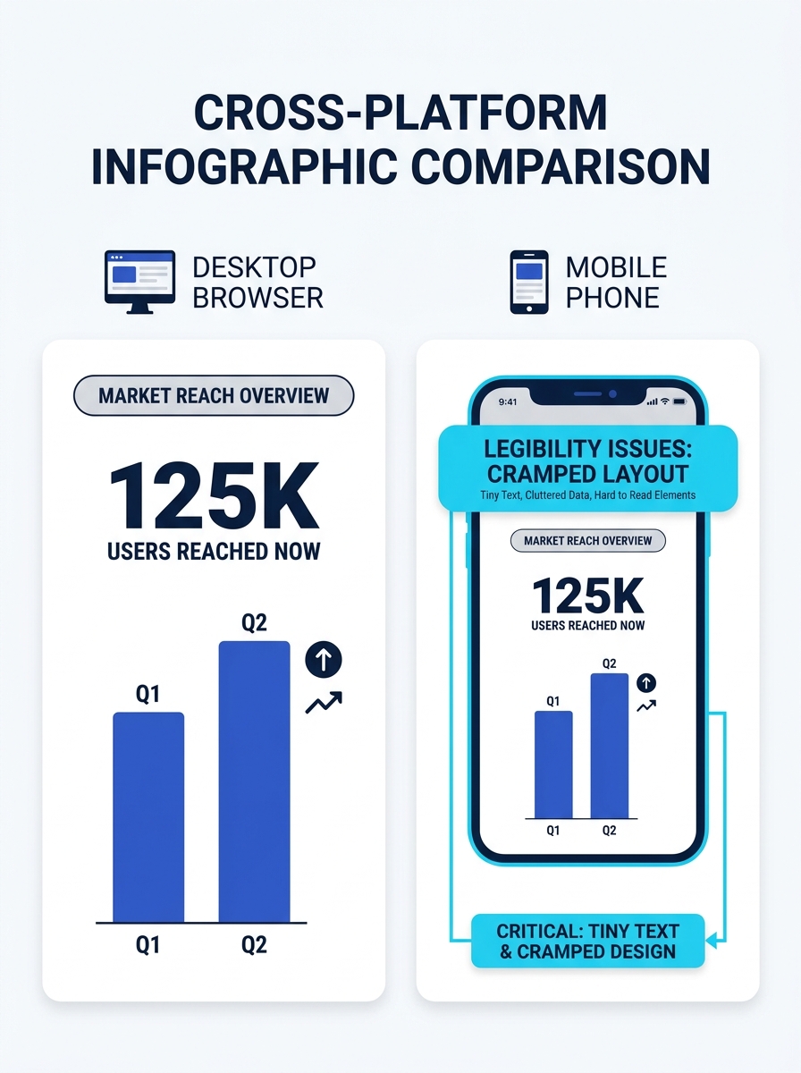
Over 70% of social media content is consumed on mobile devices, and 79% of users abandon content that doesn’t render well on their screen. Infographics originally built for blog embeds at 800 pixels wide get crushed in mobile feeds. Instagram crops them. LinkedIn compresses them. Facebook buries them in a scroll where 10-point text becomes an illegible smudge.
The fix is straightforward: set your minimum body text at 16 points and test every design at 25% zoom on your monitor before export. If you can’t read a data label at that scale, your audience won’t read it on their phone either. Jeff Bullas, digital marketing strategist writing in Social Media Today, ranks legibility on small screens as the most overlooked factor in infographic virality. He’s right. A beautifully illustrated data story that nobody can actually read is decorative noise.
Build your working canvas at the final export dimensions from the start rather than designing wide and resizing later. Downscaling introduces compression artifacts, and text anti-aliasing degrades noticeably at non-native resolutions.
Match dimensions to the platform before you open a template
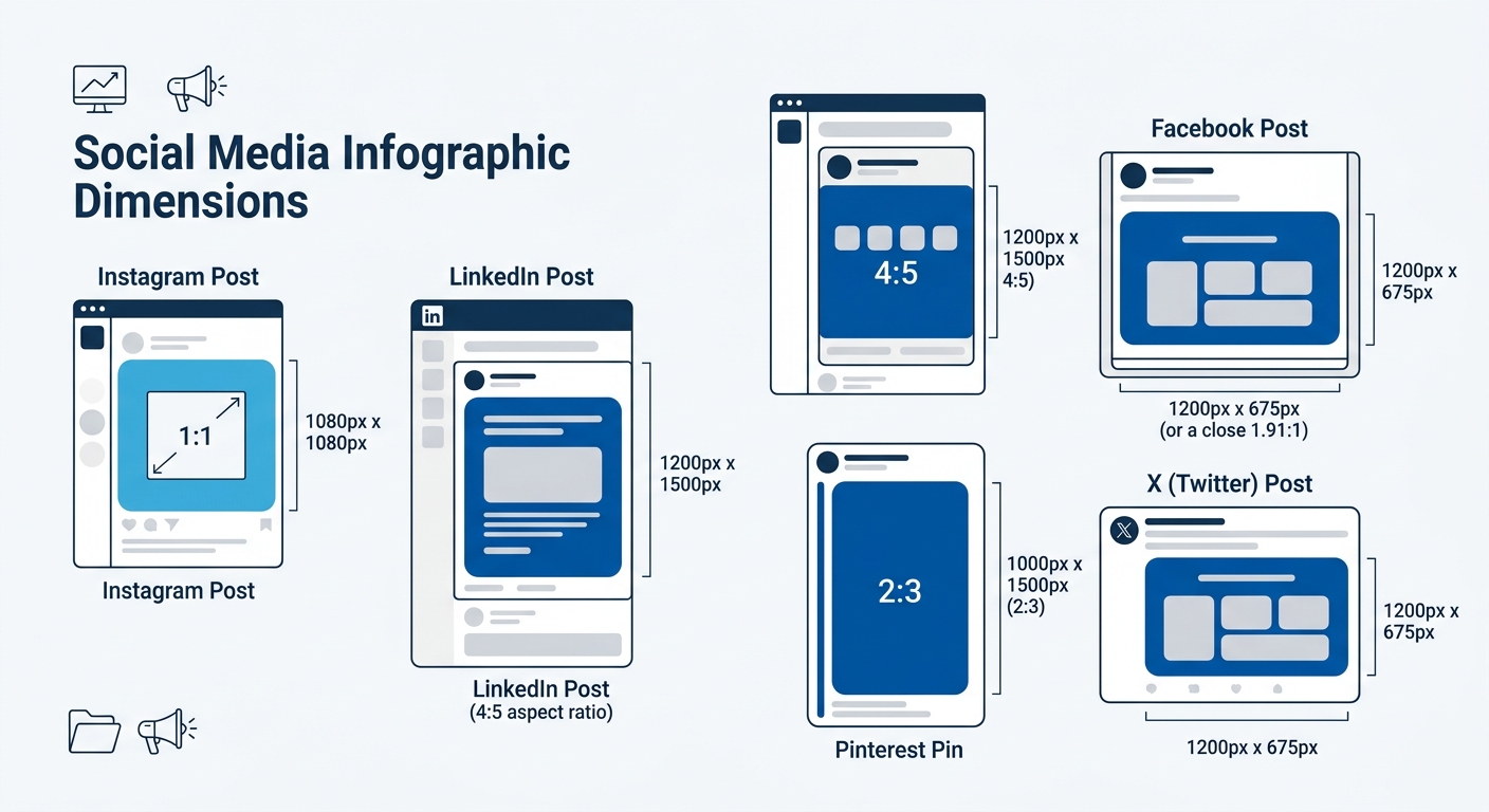
Every platform has its own optimal dimensions, and uploading a single file everywhere is the fastest way to get cropped, compressed, or buried. According to Venngage’s infographic size guide, a 1080×1350 pixel image carries a 4:5 aspect ratio, which is the maximum vertical real estate Instagram allows in-feed. That same dimension works well on LinkedIn’s feed, where vertical content occupies more scroll space and drives higher dwell time.
Facebook performs better with square formats at 1080×1080 pixels or the 1200×630 pixel landscape for link previews. Pinterest operates in a different vertical range entirely, with recommended aspect ratios between 2:3 and 1:3.5, making 1000×1500 pixels a reliable starting point. X (formerly Twitter) favors 1200×675 pixel landscapes that fill the timeline card without cropping.
| Platform | Optimal Infographic Size | Aspect Ratio | Notes |
|---|---|---|---|
| Instagram Feed | 1080 × 1350 px | 4:5 | Maximum vertical space in-feed |
| Instagram Carousel | 1080 × 1350 px per slide | 4:5 | Up to 20 slides |
| LinkedIn Feed | 1080 × 1350 px | 4:5 | Vertical content earns more scroll real estate |
| Facebook Post | 1080 × 1080 px | 1:1 | Square performs most consistently |
| Pinterest Pin | 1000 × 1500 px | 2:3 | Can extend to 1:3.5 for tall pins |
| X (Twitter) | 1200 × 675 px | 16:9 | Landscape orientation preferred |
Your agency should be producing platform-native exports from the same source file, not running a single export through a resizer. This is where the workflow conversation matters. If your team has been grappling with content production bottlenecks, infographic resizing is one of the tasks that creates the most rework when handled ad hoc rather than templated from the start.
Limit your palette to three colors and mean it
The research is consistent: infographics that use a maximum of 3 colors to encode meaning outperform designs with broader palettes. The constraint is cognitive, not aesthetic. The human brain processes visual information 30x faster than text, but that speed advantage collapses when the viewer has to decode a complex color system before understanding what the data says.
Pick one primary brand color, one accent for emphasis or callouts, and one neutral (typically a dark gray or off-white) for background and body text. Every additional color you introduce adds a decision the viewer has to make, and on a platform where the average content view lasts under 3 seconds, that cognitive overhead kills engagement.
Tip: If your brand guidelines mandate more than three colors, reserve the extras for your website and print materials. Social infographics are consumed at speed and at small scale. Simplicity here is a performance variable, not a design constraint.
Break one idea into one frame
The traditional infographic format, a long vertical scroll with 8 to 12 data points, was built for blog embeds. Social feeds reward a different structure. As the editorial team at Cooler Insights writes, infographics on social media “can be used as a standalone piece of content or to supplement a long-form piece of content,” and the standalone route demands that each frame deliver a complete insight without requiring the viewer to scroll further.
Carousel infographics on Instagram and LinkedIn have changed this calculation significantly. A 10-slide carousel at 1080×1350 pixels per slide gives you the space of a traditional long-form infographic, broken into digestible frames that algorithms reward with longer dwell time. Each slide should carry one stat, one comparison, or one step in a process. The balance between text and imagery should hover around 50/50 per slide.
Icon charts work especially well in this single-insight format. Visme’s social media infographic guide demonstrates how a single icon repeated in different fill states can represent percentages or category breakdowns without any supporting text beyond a label and a number. That’s the level of simplicity to target: one icon, one number, one takeaway per frame.
Social feeds reward frequency of focused insights over occasional dense data dumps. A 10-slide carousel with one stat per frame outperforms a single graphic with 10 stats crammed together.
This approach to focused, single-insight visual content connects directly to how brands build authority on social platforms. Consistent, clear, well-branded frames build recognition faster than sporadic information overloads.
Cite your data source in the footer of every graphic
Infographics earn 178% more inbound links than other visual content types. That link-earning power depends on credibility, and credibility depends on visible sourcing. Audiences across LinkedIn, Facebook, and X have grown increasingly data-literate, and unsourced statistics trigger skepticism rather than shares.
Place a source line in the bottom 5-10% of every infographic frame. Use a smaller font size (10-12 points works here since source citations serve verification rather than at-a-glance readability) and include the organization name, the study or report title, and the year. For carousel formats, cite on each slide that introduces a new data point rather than lumping all sources onto a final slide that most viewers never reach.
This sourcing habit also protects your brand from the credibility fallout that hits when someone screenshots your graphic and it circulates without context. If the source is baked into the image file, the provenance travels with it, regardless of where it ends up. Enterprise brands already navigating heightened authenticity demands understand this instinctively: visible evidence of rigor is itself a brand signal.
Never upload the same file to every platform
The Stellar Content blog states it plainly: “When sharing an infographic, it’s best not to upload the same image across all profiles and call it a day.” This is the most frequently broken rule in social media infographic distribution, and it costs more engagement than any design flaw.
Each platform compresses images differently. Facebook applies aggressive JPEG compression that degrades text clarity on detailed graphics. Instagram resamples uploads to fit its internal resolution standards. LinkedIn’s feed renderer handles PNG files differently than JPG. And X strips metadata and recompresses at lower quality thresholds than any other major platform.
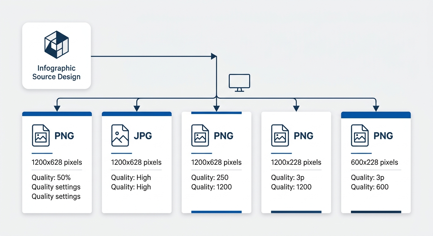
The practical answer: export platform-specific files from your source design. PNG for platforms where text clarity matters most, particularly LinkedIn and Instagram. JPG at 85-95% quality for Facebook, where file size affects load speed in the feed. Tools like Adobe Express and Canva allow multi-format export from a single design source, which reduces the manual effort substantially.
If you’re working with an agency, this multi-export requirement should be written into the creative brief. The difference between a brand that gets consistent visual traction and one that doesn’t often comes down to whether the final deliverable includes platform-native files or a single generic export. The same principle applies when you evaluate high-traffic content for conversion performance: what looks fine at the production stage can underperform at the distribution stage if format-fit was never tested.
When These Rules Conflict
These six principles work in tension with each other. A three-color palette is ideal, but some data visualizations genuinely require four or five categories, each needing a distinct hue. Single-insight frames are the default, but a comparison infographic that places two datasets side by side on one slide sometimes communicates more effectively than splitting them across two carousel cards.
The underlying principle behind all six rules is the same: respect the constraints of the medium. Social feeds are small, fast, and competitive. Every design decision should reduce the cognitive effort required to understand your graphic in under 3 seconds on a phone screen. When two rules conflict, the one that reduces viewer effort wins.
And when you’re briefing an agency or evaluating infographic deliverables, the checklist is short. Confirm platform-specific dimensions. Confirm text legibility at mobile scale. Confirm source citations are baked into every frame. Confirm separate export files for each platform. Those four checks catch the majority of infographic failures before they reach your audience’s feed, and they take about 90 seconds to verify on a finished deliverable.