Remarkable Web Design & Development Services
High-Performance. Intuitive. Visually Exceptional.
A web design agency that creates conversion-focused digital experiences that balance powerful backend performance, effortless usability, and striking visual identity—ensuring your website performs today and adapts to tomorrow’s demands.
Web Design Services That Build Beyond Visuals
A visually compelling website design captures attention—but performance turns traffic into meaningful engagement and consistent conversions.
With our web development services, your business’s website can:
- Capture attention in seconds
- Instill trust with expert design
- Own your identity in any market
- Be future ready
If your website is all aesthetics and no performance, you’re paying for a digital storefront with no customers. Don’t let an underperforming site hold back your digital growth.

Web Design That Works as Hard as You Do
High-Performance Architecture
As a results-driven website design company, we engineer sites that are Core Web Vitals compliant and performance-optimized from day one. We audit over 35 technical elements your SEO agency or marketing team may need—ensuring your website is structured for speed, stability, and scalability.
SEO & Digital Marketing–Ready Framework
Our web design services ensure every website is structured to support on-page SEO, schema implementation, landing pages, tracking integrations, and future optimizations. We make it easy for internal teams or external partners to execute campaigns without rebuilding your digital infrastructure.
Collaborative, Strategy-Led Design
We co-create with your team to ensure our web design efforts reflect your brand, speak to your audience, and support business objectives. Beyond technical performance, we design experiences that resonate with your customers and decision-makers.
Post-Launch Technical Support
Our web development process doesn’t end at launch. We include one month of web maintenance to ensure stability, performance monitoring, and immediate issue resolution to ensure seamless transition from build to business operations.
Stunning, Conversion-Focused Design
Our website design experts craft tailored digital experiences—never cookie-cutter templates. Every layout, visual element, and interaction is purpose-built to strengthen brand credibility and guide users toward meaningful action.
Ready to Get Better Results?

How Truelogic Builds Winning Websites
01
02
03
04


Discovery
insight-driven strategy
We uncover goals, align teams, and map out strong project foundation before design begins.
Discovery
insight-driven strategy
Foundation that shapes every project


Design
SEO-Ready, Pixel-Perfect
We craft visuals that enhance search visibility while delivering a smooth and seamless user experience.
Design
SEO-Ready, Pixel-Perfect
Feature that bring every design to life


Develop
Fast, Flexible, and Future-Proof.
We build websites engineered for performance that is optimized for speed, security, and scalability.
Develop
Fast, Flexible, and Future-Proof.
Core feature that power every build


Deliver
Seamless Launch & Delivery
We don’t just launch your website, we work with you to ensure smooth operations and continued growth long after go-live.
Deliver
Seamless Launch & Delivery
Built for smooth launch and success
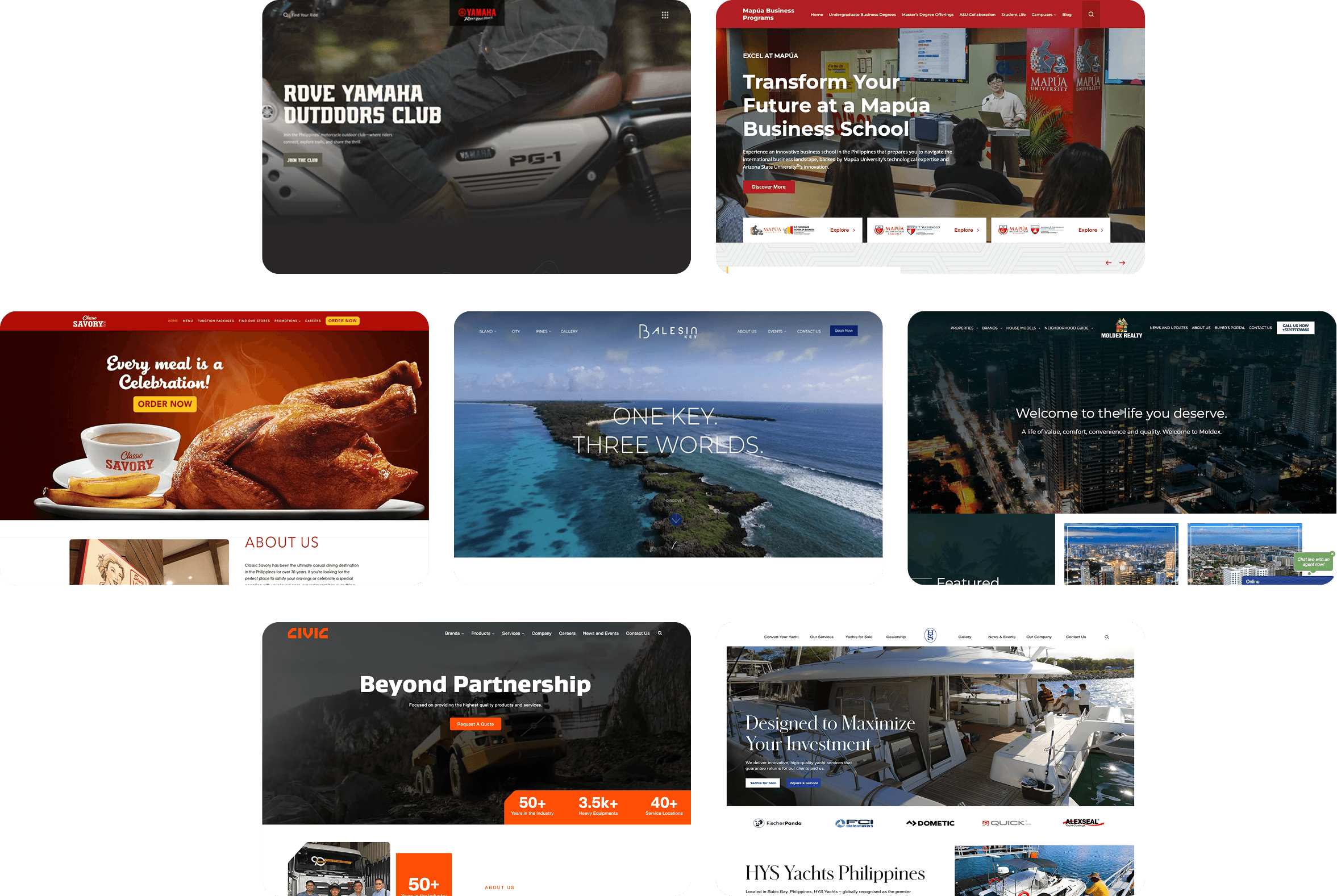
Websites Built to Perform
We design and develop websites aligned with each brand’s identity, audience expectations, and measurable business objectives.

Client
Testimonials
Hear from the brands behind our most successful websites.
Refine Your Design. Redefine Your Impact.
Move beyond surface-level design with strategy-led web development solutions.


Partner with the Masters of Website Redesign
With 17 years of industry experience, Truelogic is a seasoned web design agency trusted by businesses to transform underperforming websites into strategic digital assets. We combine deep SEO expertise with web development to ensure every redesign supports visibility and long-term growth. Through a collaborative, strategy-led approach, we align design, performance, and business objectives from day one.


