Ecommerce Website Design Tips: Develop a Website That Sells

Your website is your most expensive salesperson. It works 24/7, answers questions, and either builds trust—or destroys it. Good web design isn’t about trends. It’s about clarity, speed, and confidence.
In the Philippines, most visits happen on mobile. That means your design has to be fast, thumb‑friendly, and straight to the point. If people get confused or wait too long, they bounce. Simple as that.
1) Start with one clear purpose per page
If a page tries to do five things, it usually does none. Define one primary action—book a call, request a quote, buy a product—and design around it. Everything else should support that action, not distract from it.
Think about where this page sits in the customer journey. A homepage might focus on trust and navigation, while a product page should focus on the offer and proof. The goal changes, the layout should change with it.
2) Design for mobile first, not just responsive
“Responsive” isn’t enough. Design for the smallest screen first, then scale up. That forces you to prioritize essentials and cut fluff.
A simple rule: if a button is hard to tap with one thumb, it’s too small. Same for forms—shorten them or you lose conversions fast.
Use sticky CTAs for high‑intent pages. And keep navigation clean. Five top‑level links is usually enough.
2.5) Make the above‑the‑fold count
The first screen should answer three questions fast: What do you do? Who is it for? What should I do next? If any of those are unclear, the rest of the page won’t save you.
Keep the hero section short, use a specific headline, and give a clear action. Save the long explanations for lower sections.

3) Speed is part of design
Design choices affect performance. Heavy visuals, autoplay videos, or oversized hero images can slow the site and hurt rankings. Google’s Core Web Vitals thresholds remain the baseline: LCP ≤ 2.5s, INP ≤ 200ms, and CLS ≤ 0.1.
And most sites still struggle. The 2025 HTTP Archive Web Almanac reports that only 48% of mobile sites pass Core Web Vitals. That’s a lot of room for advantage if you design for performance early.
Design choices affect load times. Compress images, avoid huge background videos, and limit heavy animations. You can still look premium without making users wait. That balance is what separates good websites from pretty but slow ones.
Use lazy loading for media below the fold, keep font files minimal, and avoid loading five different icon packs. Every extra asset slows the experience, especially on mid‑range phones.
3.5) Navigation that feels obvious
Visitors should know where to go in three seconds. If they hesitate, they leave. Keep menus short, label them clearly, and add a visible path to your main CTA.
For service businesses, a simple structure works best: Services, Work/Case Studies, About, Blog, Contact. Don’t overthink it.
4) Use visual hierarchy to guide attention
People scan before they read. Use size, spacing, and contrast to guide the eye. One strong headline, one supporting line, one clear CTA. That’s enough.
Cluttered pages create decision fatigue. And when visitors feel tired, they leave.
Use spacing to create breathing room. White space is not wasted space—it’s what helps people understand what they’re looking at.
5) Typography can make or break readability
Good typography is invisible. It keeps readers moving. Use a readable base size, clear line spacing, and consistent styles across headings.
If you’re unsure, keep it simple: one display font for headlines and one clean body font. That’s it.
Consistency matters more than creativity here. If your font sizes jump around, readers feel it—even if they can’t explain why.
Keep line lengths comfortable. Long lines are tiring, short lines feel choppy. Aim for balance.
5.5) Use visuals with intent
Stock photos are fine, but generic visuals feel generic. Use imagery that supports your message—team photos, product shots, or results. If visuals don’t add clarity, remove them.
Also compress images. A beautiful hero that takes 5 seconds to load is a conversion killer.
6) Build scannable content blocks
Long paragraphs are a conversion killer. Break content into short blocks, bullets, and mini‑headlines. It’s not dumbing down—it’s respecting attention spans.
And don’t hide key info. Pricing ranges, timelines, and FAQs reduce uncertainty. If visitors have to guess, they’ll leave.
6.5) Explain the offer in plain language
Most visitors are not experts. Avoid jargon and buzzwords. Instead, describe outcomes: faster approvals, more inquiries, or simpler onboarding. If a reader needs to decode your service, you’ve lost them.
A simple framework: problem → promise → proof. State the problem you solve, the result you deliver, then back it up with a short example or metric.
7) Make CTAs obvious and specific
“Submit” isn’t a CTA. “Get my proposal” is. Use action‑driven copy that tells people what happens next. And keep your primary CTA visible above the fold.
Also repeat your CTA at logical points—after a benefits section, after a case study, and at the end. It’s not annoying if it’s helpful.
8) Add trust signals early
First impressions matter. In fact, Clutch’s 2025 web design stats note that 94% of first impressions are design‑related. That means your site’s look and feel directly affects whether people believe you.
Add testimonials, client logos, awards, and real contact info near the top. You’re reducing risk in the buyer’s mind.
If you have results, quantify them. “+32% leads in 3 months” is stronger than “great results.” Specifics feel real.
8.5) Show local relevance
Local cues matter. Prices in PHP, local phone numbers, and clear delivery coverage build confidence. If you’re serving a specific city, say so. It signals that you’re not just a generic global brand.
Even small touches help: photos of your team, a local address, or a short paragraph about how you work with Philippine clients. It makes the site feel real—and that improves conversions.
If you sell online, show shipping timelines and accepted payment methods up front. Clear expectations reduce drop‑offs.
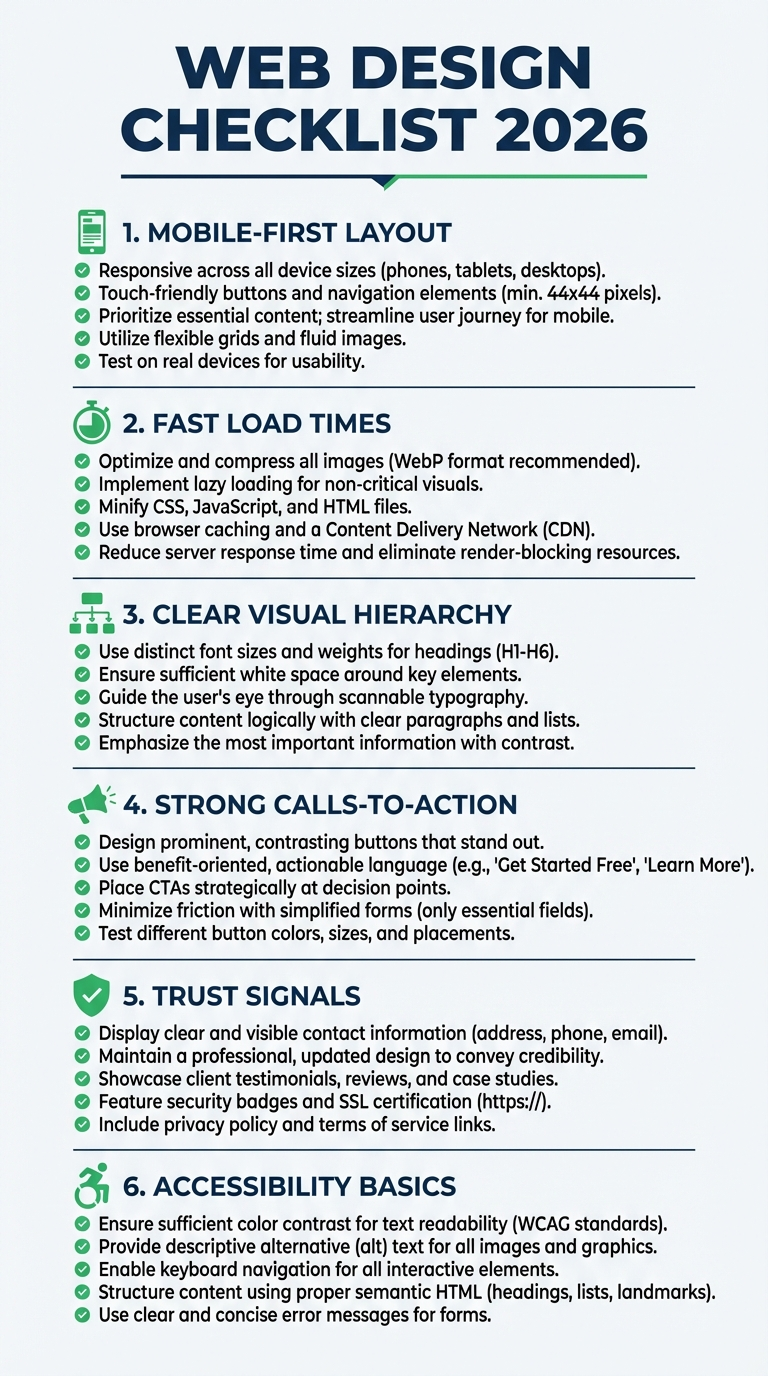
9) Accessibility isn’t optional anymore
Accessible sites are clearer and easier to use. That helps everyone. Use enough color contrast, clear focus states, and readable font sizes. If someone can’t navigate your site with a keyboard, you’re losing potential customers.
Small steps go a long way: add descriptive alt text for images, make links obvious, and avoid relying on color alone to explain meaning. It’s good UX and good business.

10) Structure pages for search engines too
Design and SEO should work together. Use a logical heading hierarchy, descriptive page titles, and clean internal linking. That’s how Google understands your content.
Also make sure every important page is reachable within a few clicks. If it’s buried in the footer, search engines and users will treat it as less important.
Internal links help both users and search engines. Link from service pages to related blog posts and back again. It keeps people moving and gives Google a clearer map of your site.
If you’re pairing a redesign with search growth, these technical SEO improvements are a must.
11) Reduce friction in the conversion path
Look at every step between a visitor and your main goal. Can you remove one click? Can you pre‑fill a field? Can you clarify what happens after they hit “send”?
Use microcopy to reduce doubt: “We reply within 24 hours” or “No credit card required.” These tiny lines do real work.
Progress indicators help too. If there are multiple steps, show how many are left. People hate surprises.
Small wins add up. And if you need help, our CRO services focus on exactly this gap.
12) Maintain and iterate
Design isn’t a one‑time project. Review your analytics monthly, watch where people drop off, and tweak sections that underperform. It’s the cheapest way to keep the site growing without a full rebuild.
Quarterly audits help too. Check broken links, outdated images, and old messaging. Small fixes keep the site fresh.
Seasonal updates matter if you run promos. Swap banners, adjust CTAs, and keep offers current so the site never feels stale.
Key takeaways
FAQs
How often should I redesign a website?
Every 2–4 years is typical, but smaller updates should happen more frequently based on performance data and business changes.
Does design affect SEO?
Yes. Page speed, structure, mobile experience, and engagement signals all influence how search engines evaluate a site.
Need a website that converts?
If you want a site that looks sharp and drives real business results, explore our web design services or talk to the Truelogic team about a rebuild.