Responsive Web Design: Why It Matters To Your Business

Are you wondering how your competitors are ranking on search engines considering you both have the same content on your website? Or were you ranking before but noticed that your ranking has been dropping by the day? Have you ever wondered why competitors are ranking for searches that you should be ranking for instead? Did you ever stop to ask how mobile-friendly your business website is?
Today, 96% of internet users access the web via mobile phones and mobile accounts for about 60% of global web traffic, so responsive design must be touch‑first and performance‑first. Google also replaced FID with INP as a Core Web Vital (March 2024), meaning interaction responsiveness is now a ranking priority—not just load speed.
These are questions are some signs that your website is underperforming due to unresponsive web design. In the web design industry, every new client wants a mobile version of their website and for good reason. One-design does not fit all. Now that we live at a time where aesthetics is highly valued by the market and browsers or search engines update almost monthly, your web design should be responsive to all devices as much as possible.
What is a Responsive Web Design?
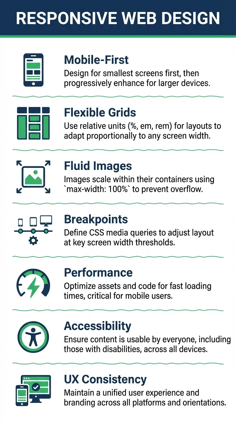
In the simplest terms, responsive web design is the concept of developing a website in a way that accommodates any user that are in different platforms such as phones and tablets. It should look and work perfectly on both large and small devices, from any brand and any OS.
Having a responsive web design eliminates the need to create different designs, hence making things more flexible, fluid grids and images in order to adapt to the different screen sizes out in the market.
As years progress, more and more businesses, companies, organizations, as well as individuals worldwide, begin to use websites actively. The good news is that more users also means more customers, but the challenge now is to make your website stand out from the competition.
As of 2020 there are approximately 1.3 billion active websites.
The internet has roughly 4.13 billion users worldwide, that’s 52 percent of the world population. Out of those numbers, the Philippines ranks at 11th place as the country with the most internet users.
Needless to say, web design is a booming industry. Which means different things for a lot of people.
It wasn’t a common problem a decade ago when we all used desktop or laptops as our main drivers, but now, we have the smartphones — and they just keep coming every year. In January 2020, an estimate of 173.2 million mobile connections was documented in the Philippines alone. That’s an increase of 28 percent from the previous year.
More and more devices are coming out each year, what that means for you and your web designer is that you have to make sure your website will look good in all these devices that your consumers use.
How do you define a responsive web design?

Responsive web design is a lot more different from the concept of traditional web design which is what the general user is more conscious of. Responsive design leans heavier on the technical aspect of web development and the creative angle which then amplifies the effectiveness of a site.
The simplest explanation would be creating designs that can adapt to different dimensions without needing to create specific designs across each platform. It’s also about solving problems, along with the flexibility that it has (fluidity in both grids and images). When outsourcing web design, your designer has to know how to make it user-friendly. Your web developer should be able to explain to you how can it be easier for people to navigate your site when using smaller devices such as iPhones or android phones.
Why is having a responsive website important?

A responsive website keeps the engagement with your audience alive. The easier it is for your audience to navigate the website the more they would want to stay and explore it. If a website isn’t responsive, it can lead to users leaving the site because the image might be too big, or the buttons too small. Having a responsive web design helps in making the design not too overwhelming for the audience so that they can use it without a problem.
Why is having a responsive web site necessary for your businesses?

July 2019, Google announced that mobile-first indexing will be their default form of indexing for newer websites. This means that the search engine predominantly uses a website’s mobile version of the content for indexing and ranking purposes.
In the past, Google used the desktop version of a website to evaluate its relevance. Now that users can access websites through mobile devices that has changed.
Google evaluates a website’s ranking in many ways, but the most popular ranking factors are site traffic, the duration of time users browse your site (average time on page), how many relevant sites are linking to it, the relevance of content, content length, load speed, page optimization and more. These factors shouldn’t only be optimized for desktop. Since Google is going to be using the mobile version of your website for evaluation, you now have to optimize your content and design for mobile too.
If a business doesn’t have a responsive website, it will be harder for the users to find what they are looking for in a business which will result with the user leaving the website. There are a couple of reasons, like the buttons may be too small, or the smaller scale of the website can be overwhelming. It will be hard for them to concentrate and figure out where to find what they’re looking for.
What makes a responsive web design?

1. Flexible Layout

Back then, flexible layouts had a different meaning. It meant being able to move elements anywhere you want, in any column or corner of the website. Due to grid limitations, sometimes elements wouldn’t align or would look off when viewed on a different browser.
That concept has changed today as more and more devices are released. A flexible layout today, means creating designs that can adapt to different dimensions without having to create specific designs for each platform. It’s about solving problems, along with the flexibility that it has (fluidity in both grids and images). The web designer has to figure out how it can be user-friendly and the developer has to find a way to make it easier for people to navigate websites using smaller devices such as iPhones or android phones.
2. Adaptive Images

Adaptive images, also called ‘flexible images’, means that images should be proportionate so that they look good on both large and small devices. Your web designer should be able to make your website images move and scale with your flexible layout. This way images on your site will respond to different layout and perspectives on different display resolutions.
Images play a huge part of your website but make sure to include images that are optimized. This means uploading images that are guaranteed to load fast to compliment your site speed. Discuss this with your web developer and do the same thing with your videos.
3. Custom Layout for multiple devices
Sometimes a website that’s designed for a mobile phone doesn’t offer that same experience on a tablet, this means your website should provide an alternative layout or design.
To see whether or not your website is responsive, you can use Google’s mobile-friendly test. This will show you if the pages on your site are working well on mobile. Another way to see if your website is mobile-friendly is through the Chrome browser.
Just follow these simple steps on your Google Chrome browser:
- Open your Chrome Browser
- Go to your site
- Hold Ctrl+Shift+I to open Chrome DevTools
- Press the payout icon on top of the toolbar right beside devices.
- You can now view your page in desktop, mobile or tablet layout.
4. A design that works for both touchscreens and cursors
Touchscreens come with different guidelines than cursor-based interaction. One of the differences is that touchscreens can’t display CSS ‘hovers’ since there’s no cursor to hover on an element.
Another factor to consider in this section is the accessibility of sub-navigation bars. For example, positioning them on the right side of the page would be more user-friendly for right-handed touch screen users. Why? Because they wouldn’t brush on the navigation by accident when holding the device in the left hand. Meanwhile, when the device is cursor-based, this wouldn’t make much difference.
5. Redesigning Content
Redesigning content means resizing or altering how your content appears so that it fits the design of the website. Research shows that 61 percent of users bounce from a site if they don’t find what they’re looking for quickly. This will lead them to look at other competitors’ site, this is something that you don’t want to happen. This is why it’s important to restructure content so that it’s easy to view and navigate.
- Don’t overload users
- Minimize use of images for creating text (so that it loads faster)
- Make sure that any video you upload is working perfectly
- Make sure that the key content is easy to navigate. Whether they want to go to the store, the blog, their account, or the homepage.
- Showing or shrinking content to make the whole web design look symmetrical and proportional.
Redesigning content means that you take each content type and break them down into smaller pieces, format, or blocks that fit into the web design. It can be cutting a whole blog summary and simply placing ‘more’ right after a quick one liner. This will make for a cleaner look that will fit the web design.
6. a website that loads fast
Studies show that 74 percent of users exit the mobile website if it takes more than five seconds to load. This factor is difficult for most marketers to understand since something like a split second can’t really be tallied. Research also shows that a 100-millisecond delay in a page’s load time can cause conversion rates to drop by 7 percent.
So, what should be your target when it comes to page speed? Recent findings show that a website that loads in a matter of 1 to 3 seconds can increase bounce rate by up to 32%. A load speed of 1 to 5 seconds has the chance of increasing bounce rate by 90%, while if your website takes from 6 to 10 seconds to load then that will increase bounce rate by up to 123%. The point here is that you don’t want to lose a potential deal just because your website isn’t fast enough.
An ideal webpage should load in three seconds or less, any more and you’ll risk losing visitors. There are tools out there that can test your loading time, we recommend using PageSpeed Insights.
To enhance the loading of your website and overall efficiency, be conscious of the files that you use and upload. Try to explore and test other file formats, reduce image sizes and look into compressing files. These methods will allow you to use less bandwidth that will get you a faster loading page.
Key Takeaways
At the end of the day, your website’s main goal is to generate leads. Think of it like a shopping mall. Nobody likes to enter, much more spend money in a place that’s outdated and worn down. A responsive web design that delivers a modern or professional look and is more likely to generate leads and convert. So making your website as responsive as possible should be on top of your priority list.
If you’re going to outsource your web design and development services, make sure to work with a digital marketing agency that has been in the industry for a long time. This will ensure that they have the experience, have worked with a lot of clients or different websites in the past, and that they are aware of the updates in the industry. You will be able to see the quality of their services from their previous projects and judge from there if the company is suited for you.


