How to combine aesthetics and user experience for the best website for customers
The need to marry beauty with function hit an all-time high with the rise of e-commerce and at-home shopping brought on by the pandemic. Brands’ online spaces no longer exist simply to inform and announce, list and sell, or wow and impress. They’ve evolved to become highly imaginative, limitless extensions of brands’ physical shops and identities, redefining what it means to give customers modern and memorable buying experiences.
When we talk about the aesthetics of online assets, we refer to all things visual; palette, typography, images, contrast in size, smart use of shapes and gradients, layout, and animated effects. These are the things that set the tone of a website for products and services or a company profile webpage, for example.
On the other hand, usability is all about ease of navigation, clarity of purpose, and functionality. Remember that an attractive web page is of little value if it’s confusing, aimless, or just for display. Customers go online and search for products and services for a reason—sometimes to make a purchase, other times to gather information or make competitor comparisons—and if your web page fails to meet this expectation, you’re going to need to re-strategize your online presence.
To help brands achieve this, we outline a comprehensive checklist they can use to gauge the quality of their digital assets’ aesthetics and usability, as well as tips for improvement.
Aesthetics
1. Is your design more fluid than rigid?
Fluidity in design is reflected in natural lines and softer shapes. The more a web page reflects the organic environment, the kinder it is to the eyes and the more appealing it is to the human brain. This is in direct contrast to rigid design that features more corners, flat edges, and straight lines, which, while suitable for some brand images, is a lot harder for the mind to process and look at for extended periods of time.
A positive online shopping experience isn’t just one that is engaging and interactive; it should be comfortable for customers, too.
2. Are your web page elements meeting the minimum requirements?
Ensure that the major elements of your web page like text and images are not obsolete and look professional. Photos must always be in optimal resolution and relevant to the topic they’re being used for. The text must be clean and readable.
Simplicity is the rule of thumb as it’s easy to go overboard and overwhelm web visitors with too many images or overly done typography. Clutter is your enemy. When in doubt, minimalism should guide you, and you can build from there.
3. Are your aesthetics consistent?
You can’t have a playful, Andy Warhol-inspired “About Us” tab and then connect that to pages of your products and services that look too formal or stiff. It’s important to plan the mood, tone, and look you want for your web pages with experienced web and graphic designers to ensure consistency and to be able to build the right atmosphere. This is a great way to build brand image and awareness.
Disjointed web design only tells customers one thing: that a brand doesn’t quite know what it’s doing online and isn’t a strong contender in the digital space.
4. Are you sacrificing readability?
If you’re only starting to get a hang of web design, prioritize text over images. Well-designed text, depending on typography and colors used, can act as a hero image when executed correctly. Quality text that’s both eye-catching and readable is core to web design effectiveness. Don’t assume that just because a web page looks artistic and creative, customers will be blown away.
Invest in time needed to figure out the right font, text size, and color palette, plus how to balance text with the rest of your web page’s elements. Besides, a web page serves its purpose only if customers can actually read it and gather the information they need from text; if all they’re doing is looking at it and appreciating aesthetics, web page remodelling is in order.
5. Do you still depend on stock images?
When websites were a new thing in the early 2000s, stock images were the way to go. These days, customers associate stock images with low-budget online platforms and generic design. Using too many of them harm your brand image and lessen your credibility as a leader in digital.
Instead, allocate budget for product shoots to achieve differentiation from competitors and grow legitimacy. You don’t even need to update images on your web pages often; just ensure that they’re sharp, original, relevant, and ideally, show your products and services in action.
6. Are you paying attention to wordiness?
Walls of text are a huge deterrent to customers. Concise and succinct is the name of the game. Plus, points are awarded for witty copies that stay in customers’ minds long after they’ve left your web page. If you need several sentences (or paragraphs!) to get your point across, you need to think of better ways to explain what you’re all about.
Long and thorough is not always better, especially if length throws off your text-to-image ratio. The only time you’re allowed to include long texts is if your website includes a blog, and even then, entries should always be less than 2,000 words.
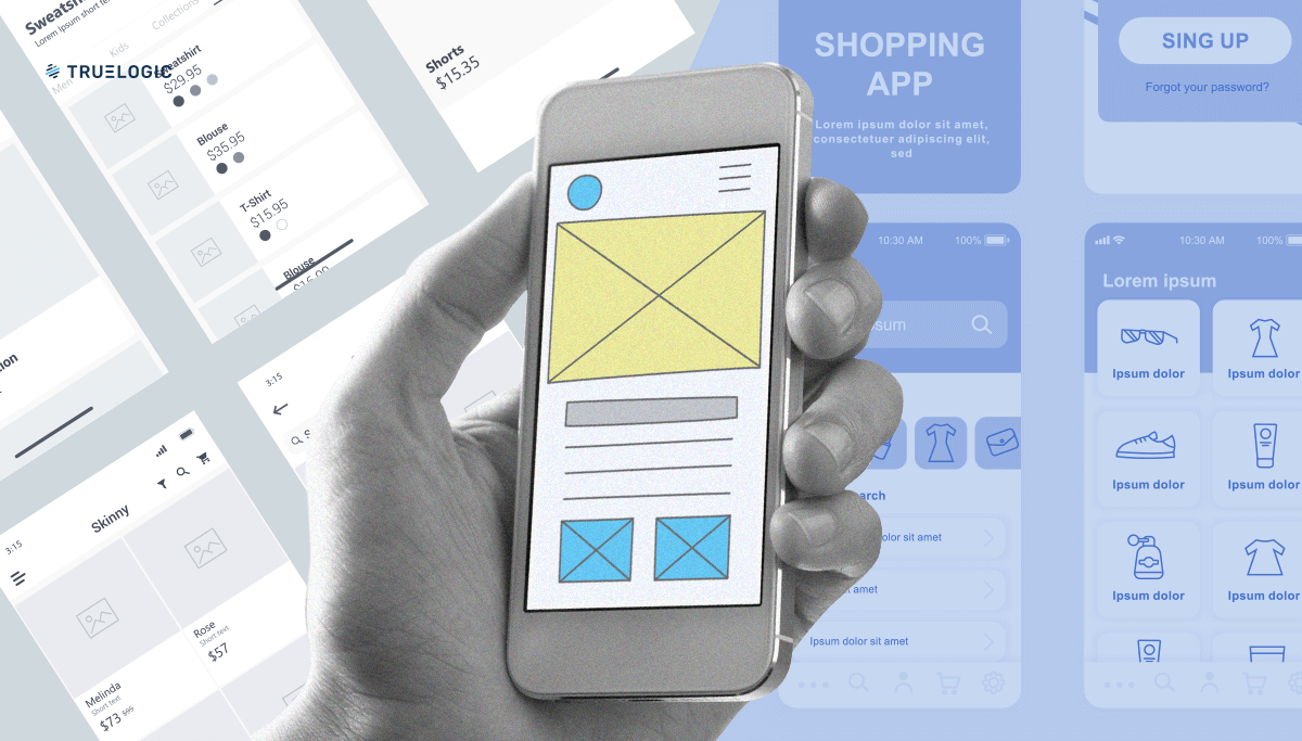
7. Have you been using layouts to your advantage?
We’ve only touched on text and images so far, but a third element should be considered when creating stunning web design: layouts. Layering, using white space, grids, choosing the right background color, going dark, or experimenting with brutalist elements all come into play when finding a layout that works.
Layouts are the bridge between text and images; it’s the “basket” that holds them together and connects the two to achieve overall coherence. Customers who only see a web page that’s a final product of all these things may not realize the impact a good layout has, but they will know if the brand made it easier or harder for them to shop.
8. Is your web design reflective of today’s trends?
A web page should mirror your branding; however, it’s still recommended that you incorporate today’s trends to show customers that you’re able to evolve with and respond to present realities. Thinking about how the pandemic has changed consumer habits forever, web pages right now and in a post-COVID panic era should reflect this.
A web page should create an atmosphere of clean and calm, comfort, and recovery. Growth, stability, and a sense of togetherness are also themes to consider. Your web page can still be “you” while being guided by what’s going on in the world right now.
Usability
1. Is your design intuitive?
Is the information you include in your web page where it’s supposed to be? Is the path to finding this information easy to follow? Do the actions needed to access this information (e.g.: clicking, swiping, scrolling) feel natural? If your answers are confidently yes, you’ve followed the basic tenets of intuitive design.
If you’re unsure of where you stand, ask someone to give your web page a go; if they’re able to locate your company profile, your contact details, product and service categories, a contact form, an FAQ section, and other page basics in just a few seconds, you’re on the right track.
2. Does your web page have outdated features?
It’s time to part with the infinite scroll, accordion menus, and carousel swiping. They’ve become dated and are being replaced by horizontal scrolling, micro-interactions, and subtle background animation. A web page that’s become dependent on these features needs a heavy overhaul. Alternatively, if your brand runs on a stricter digital asset budget, it’s completely acceptable to not have these features and keep usability at its basic.
Just like when designing aesthetics, designing usability that is simple, straightforward, and minimalist can still go a long way.
3. Do you have any auto-play elements?
Customers are turned off when they encounter auto-play background music (no matter what kind) and an excessive use of popups. For your brand’s sake, get rid of these elements immediately if you’re guilty. They catch customers off guard and disturb the mood they expect to be in when they land on your web pages.
These elements are an assault on two senses, visual and auditory, so they overpower the real content of your web page and distract customers from what you truly want them to do: to browse in peace, and to hopefully make a sale.
4. Have you made your web page’s purpose clear?
Some brands have separate pages for their products and services, their company profile, their investment opportunities, and their blog and customer reviews. If this is how your digital assets are presented, make sure to be clear about that. The last thing you want is to irritate customers by leading them to a web page that isn’t the one they were hoping to find.
Make sure that customers always end up on a landing page that immediately tells them where they’re at, rather than expect them to figure out they must go elsewhere. Additionally, link them to all your other web pages for their convenience. This helps customers see what a web page is all about from the get-go.
And of course, it helps to incorporate your best-performing SEO keywords in your landing page, headings, and welcome text. Remember that discovery starts from search and having a clear purpose on your web page may improve your SEO rankings in 2024.
5. Did you remember to include a CTA?
Calls to action are usually placed at the bottom of the page. You want to make customers feel that they’ve first read about your brand and explored your services and products to their heart’s content before being encouraged to spend money.
Aside from location, also think about what words you want to use as your CTA and stick to them. If you used “Buy now” on one page, keep using that. Don’t mix other CTAs like “Invest now” or “Purchase here,” even though they might sound similar.
6. Are you promoting your social media?
If you’re using the digital space to your full advantage, you’ll know that each of your online assets contain unique content. Your website will be a different experience from your Facebook and Instagram accounts, and each platform makes individual contributions to your online presence. Given this, promote your social media on your website (and promote your website on your social media platforms). Get customers to see the whole you.
7. Have you optimized your website for mobile use?
Most customers who do their shopping online do so on mobile, not on desktop. Hence, optimizing web pages for mobile browsing is a must, and not an option.
Web pages that take eons to load, don’t quite look right on small screens, and are difficult to navigate on phones are guaranteed to be overtaken. Aesthetics play an important role here too; design web pages that are usable on any screen while still ensuring they maintain their visual appeal.
8. Did you invest in IT backend services?
Some brands leaders think that IT and web design services are only needed when creating a new or modifying an existing website. In truth, you always need them by your side because web pages require constant maintenance.
Constant maintenance guarantees that your web pages are secure (think of all the personal and financial data customers input when making online purchases), load quickly, have no broken links, and generally have very, very few to no glitches.
As a final note, do a bit of reading on what’s called the “aesthetics-usability effect” to further guide your web page development efforts. It’s an interesting phenomenon that tells us that a beautiful web page makes customers more forgiving of minor usability issues; when they’re engaged by a website that looks pleasing, they’re also more likely to feel that it works well, too. Even in the digital space, looks matter, and they create desirable, and lasting, first impressions. When in doubt, make sure the website goes through User Testing.
In the end, customers may not realize it, but the ultimate measure of a web page they’ll want to visit repeatedly is a seamless combination of aesthetics and usability. Aesthetics come first; they’re what draw customers in, initially. And then usability follows; it’s what gets customers to stay long after their attention has been piqued.
Web pages prove that when beauty and technology merge well, it can turn into something that people may deem worthy to be part of their lives.